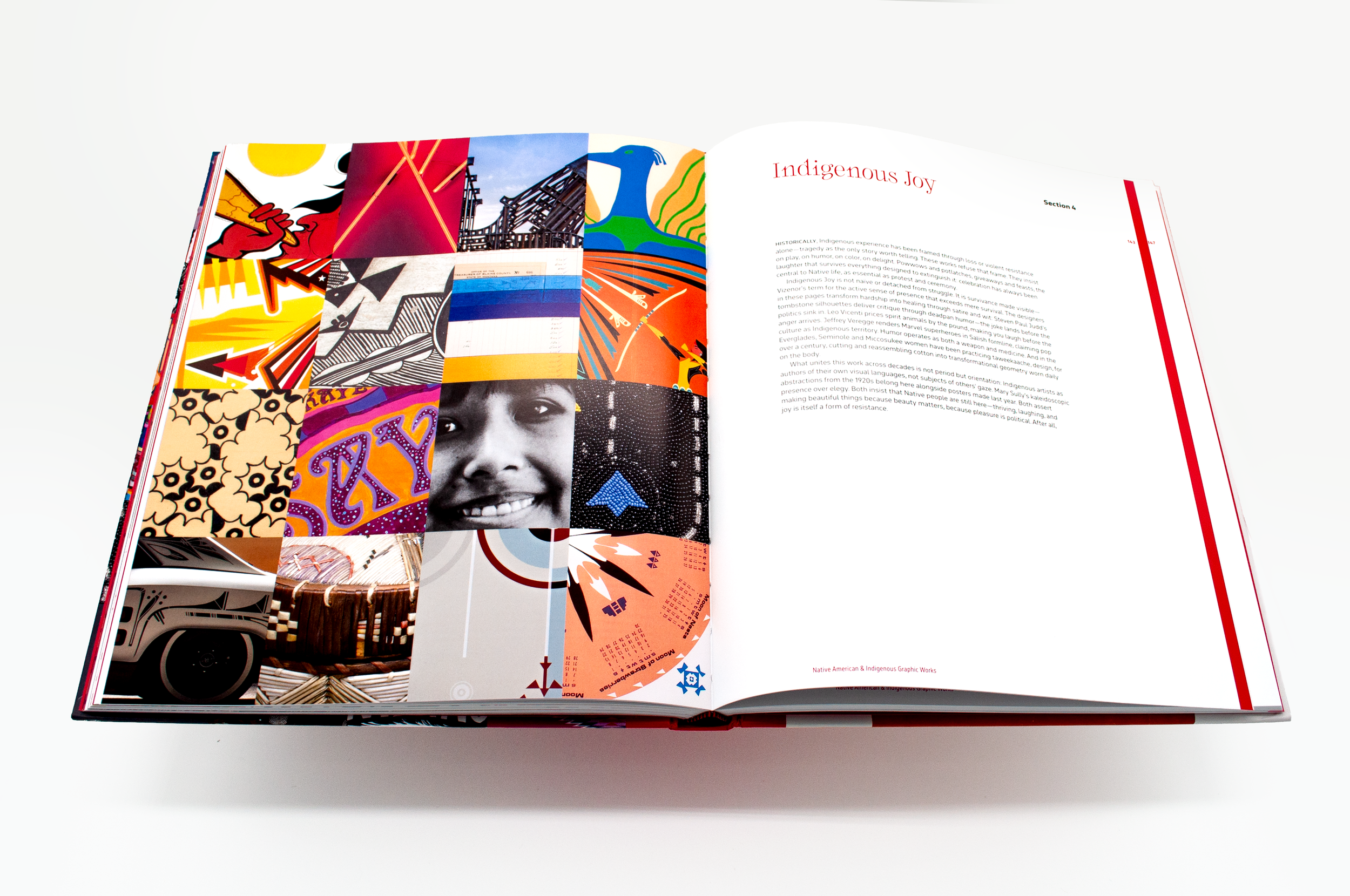
The first copy of Designed to Be Red.
Printing
I’ve had the luck (?), determination, and drive to follow my passion professionally in design for the last twenty+ years. Most of you know, or at least have gleaned from knowing me, that I love books. Reading them, smelling them, getting lost in them, and, to the chagrin of space itself, amassing and storing them. When I would tell people that I was a book designer, the common response was “oh so you design covers.” I mean yes, that is certainly one possible part of the process, but there is so so much more that goes into bookmaking. I love the design process, especially the typesetting. Which led me to wonder: who were the first Native typesetters? The answer led me down a rabbit hole of research.
The first book printed in a Native language in the American colonies was in Wôpanâak—an Algonquian language spoken by the Massachusett, Wampanoag, and Nipmuc peoples. What is known today as the Algonquin or “Eliot” Bible (why’s it gotta be named for him?!) took fourteen years to translate all sixty-six books of the Geneva Bible. The work was done not by John Eliot alone, as the naming implies, but by a team of Native translators and typesetters: Wawaus (known to the English as James Printer), Cockenoe, Job Nesuton, and Wussausmon. All of this work was done at the Cambridge press—which, by then, was housed within the Harvard Indian College (another whole Pandora’s box). There are about 40 left of the first printing today, and as luck has it, thanks to supportive friends, I reserved some time at the Morgan Library and got to visit, read, and handle a few different editions. To hold them, feel the paper, and get so close to the works was an inspirational moment. It gave me such joy to appreciate the effort of those Native men and see their creativity survive.
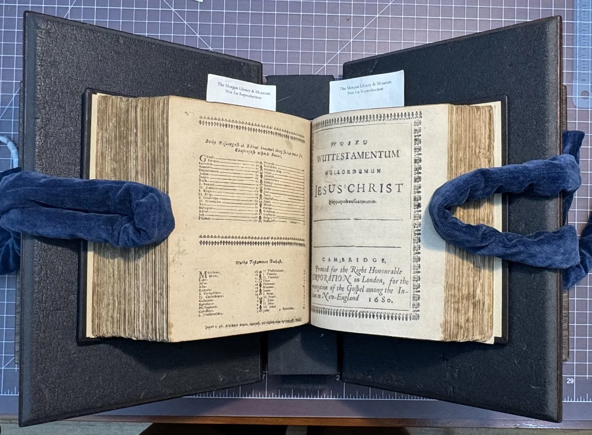
The Algonquin (Eliot) Bible, 1685 edition. Morgan Library, New York.
The printing process certainly has changed over millennia—painstakingly handset type, inking the chase by hand, placing the page, then pressing. Now ink is transferred from plates onto blankets (which is actually a rubber roller—told you it was confusing) then onto the page at a mindboggling speed. We still use terminology like plates, each representing a color: cyan, magenta, yellow, and black (CMYK—k standing for key plate, the lock-in). For Designed to Be Red, it should be no surprise that red was THE key color. To maintain consistency across every page, so that the red felt considered and special, it had to be a specific tone, so I actually had to pay for an additional plate. (For my color and design nerds, its PMS 199C). The publication printed 5/5—printers would say “five over five”—five different colored plates printing on each side of the page. A very far cry from the solo black ink of 1663. This extra plate added complexity and multiplicity to the racial flattening of the slur of the color red.
Publishing
363 years later, I get to follow in their footsteps—typesetting and publishing Designed to Be Red. It has been a monumental task. I've been in and around publishing long enough to call the process pretty old hat; to an outsider it looks insane and daunting. (In all fairness: from the inside, it's still insane and daunting.)
To keep it brief—too late—you talk a publisher into it with a proposal, then you research and write and research and write. Then you edit it. Then you edit it. Then you edit it some more. You hand it off to be read and marked up; sometimes it goes out for peer review; and once there's finally a manuscript, the real scavenging starts, chasing image permissions, paying for rights, and a hundred small things nobody warns you about; the thank-yous alone run three full pages.
But here's the part that gets me. Wawaus, Cockenoe, Job Nesuton, and Wussausmon translated that Bible, set the type, pulled the sheets, and it still went out under the Englishman’s name. Because he held the money, the standing, and they legally weren’t allowed to. Three and a half centuries later, I did the same work, did the research, the writing, the typsetting. But I was able to raise the money and put my name on the spine. That's not old hat. That's the whole point.
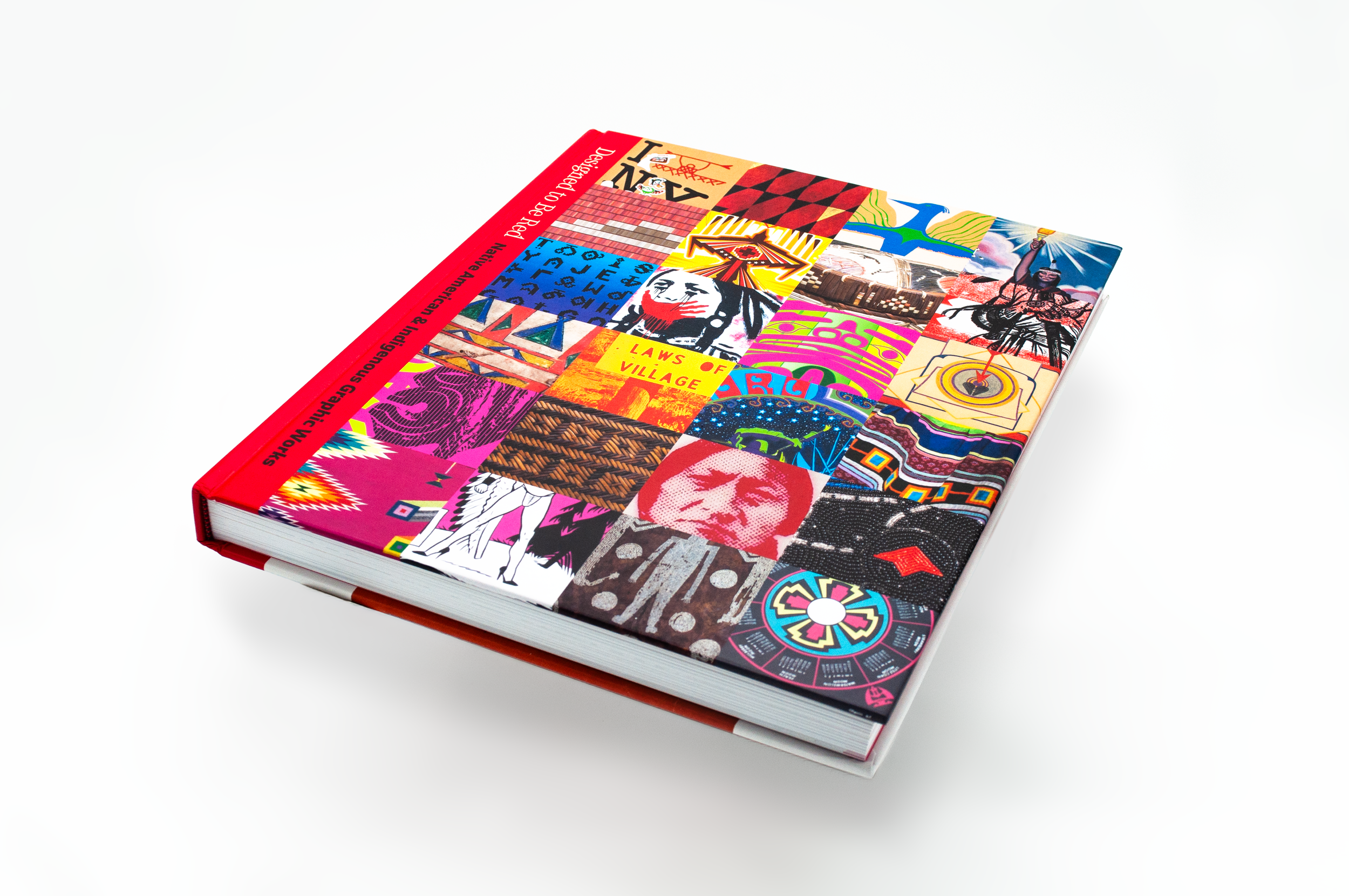
The actual book. Currently, my only physical copy till the shipment shows up! Photo by Kenneth Wical
Pre-Order
Fanfare, please: Designed to Be Red is ready for pre-order. The physical books should land within the next two weeks. I still can't quite believe I get to type and share that. The website's updated and everything's in place: www.designedtobered.com
A small gift from me and the team: the first pre-ordered 50 copies will come autographed. And if you've ever wondered whether pre-orders really matter—they do, more than anything. A pre-order is how a book like this proves, to the people who count such things, that there's an audience for eleven centuries of Native design. Please help me spread the word, recommend it to friends, teachers, designers, or just the curious. Let the team and I know if there are any questions, concerns, or special requests.
In a couple short weeks there'll be one more book out in the world, red spined with my name on it. I still can't quite believe I get to say that. Thank all of you for being here while it came together. This is just the beginning.
More soon,
—Brian